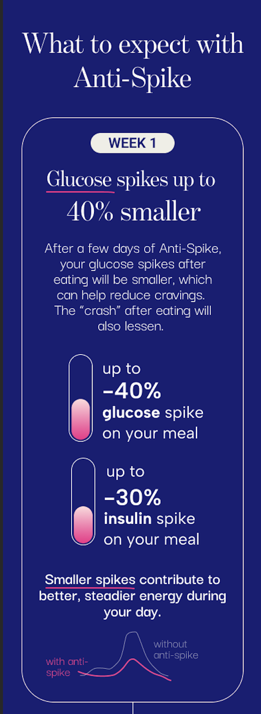
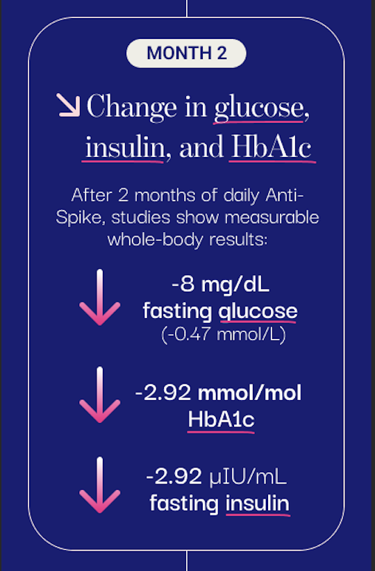
I approached this design exercise as an opportunity to rethink how the chart and social graphic communicated at a glance. The original assets lacked hierarchy, brand consistency, and scannability, so I rebuilt the visual structure—refining labeling, layout, and color usage—to create a clearer and more cohesive set of visuals.
Before / After
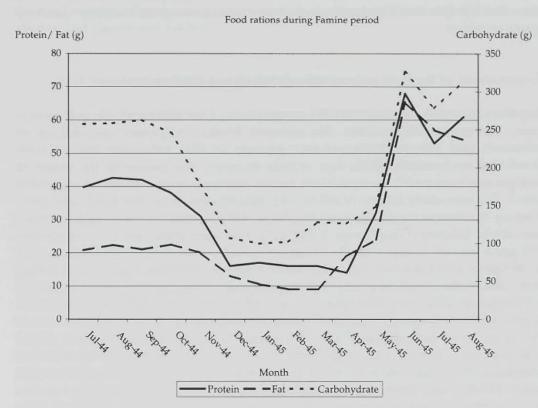
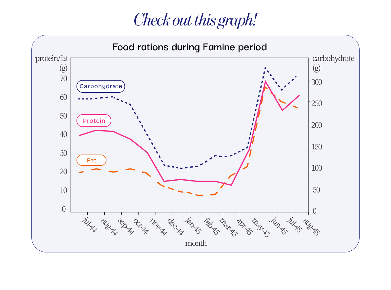
I redesigned an existing chart and product page to better align with the brand system. The goal was to reduce cognitive load by simplifying the visual hierarchy, clarifying both graphics and text, and improving overall readability, without altering the underlying content. The result is a cleaner, more consistent interface that communicates key insights at a glance.
After (1/3)
After (2/3)
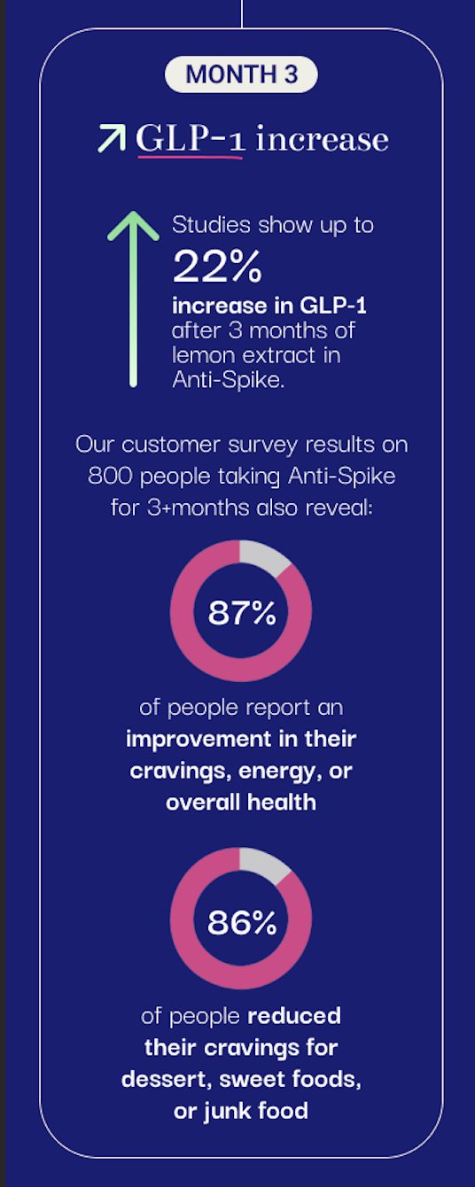
After (3/3)
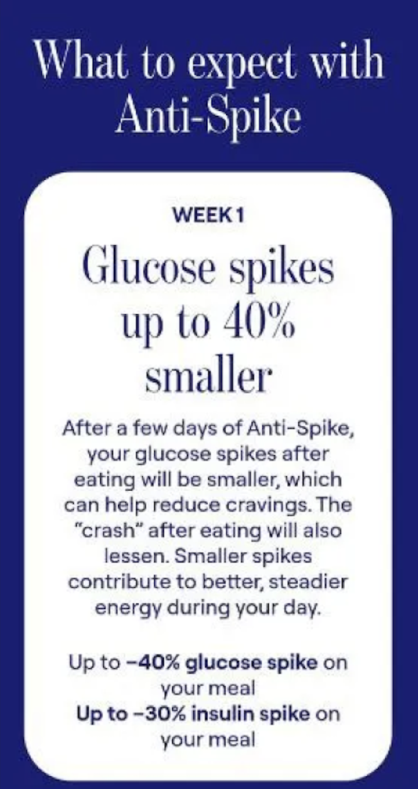
Before (1/3)
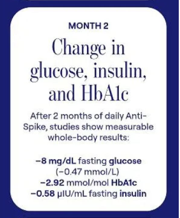
Before (2/3)

Before (3/3)